
Denver Zoo website re-design
Skills
Role
Duration
Figma
UX research
User testing
UX design
UX Designer
UX Researcher
UX Writer
August - December 2023
Summary
Redesigned the "Purchase a ticket-flow" for the Denver Zoo website for a UX design class. Conducted Research, created multiple iterations of interactive prototypes, and wrote about process. Created a simple and efficient ticket flow, to encourage the user to continue through the process to buy the ticket, and not overwhelm or confuse the user.
Role
I was the sole designer and researcher responsible for this project start to finish. I conducted user testing and research on the current Denver Zoo experience, created multiple iterations of prototypes, and published the final interactive prototype.
Challenge
Users need a simpler way to purchase tickets from the Denver Zoo without being confused or being too overwhelmed to give up during the process. The goal of this project is to create a simple, clean experience in purchasing a ticket using the current Denver Zoo design system. There are a few limitations in this project I am sticking to:
- Using the current Denver Zoo design system (colors and fonts)
- Prototype must pass WCAG AA compliance guidelines
- Only redesigning the purchase a ticket flow, and not the rest of the website
Research
As part of re-designing the ticket flow of the Denver Zoo website, I conducted UX research on the current Denver Zoo website experience. In interviewing multiple users on their experience with the website, it was found to be confusing and lacked a cohesive theme and styling.
Usability test of current product experience
In user testing, multiple pain points were identified about the current Denver Zoo web experience:
-
Multiple screens seem redundant with unnecessary information on new screens, and can instead be consolidated into less screens.
-
Too many options are provided on the sales home and ticket purchase pages, confusing the user.
-
There's an overall lack of way-finding on the current ticket flow. Users seem to not know how to go back, or where they are going next in the experience.


User testing identified multiple key opportunities to improve the purchase a ticket flow:
-
Reduce the number of screens in the ticket flow and remove redundancies across the screens.
-
Simplifying the amount of options for the user per page, and only show key information with the opportunity to see more.
-
Increase way-finding for the user.
Competitive analysis
In conducting UX Research, I conducted a competitive analysis on the experience of the Denver Zoo ticket purchase flow versus other competitors. I identified multiple competitors in the same or similar market, and compared some of the features within their own ticket flow to determine how to best update the Denver Zoo experience.

"How might we"
How might we make the checkout confirmation process faster to encourage users to buy or not rethink their purchase?
How might we “de-clutter” pages in the checkout process to make the checkout process less confusing for users?
How might we condense ticket options to simplify pages, as well as not confuse and overwhelm users with too many choices?
Design
Redesigned the "Purchase a ticket-flow" for the Denver Zoo website for a UX design class. Conducted Research, created multiple iterations of interactive prototypes, and wrote about process. Created a simple and efficient ticket flow, to encourage the user to continue through the process to buy the ticket, and not overwhelm or confuse the user.
Problem statement
The user needs a simpler way to purchase tickets to go to the Denver Zoo because the current process is confusing and overcomplicated.
User flow
In design planning, I created a user flowchart that including screens the user would see on the current Denver Zoo experience and decisions they need to make to purchase tickets. The user flowchart is valuable to see screen options, and map out the experience of a prototype. This user flowchart represents the current decision making process on the current experience of the Denver Zoo.

Low fidelity wireframes
Created a series of low-fidelity wireframes based on my user flow. The hand-sketched wireframes show proposed simplifies home screen, and few pages in the purchase a ticket flow. Wireframes serve as a raw vision to ideate layout on the page, and many updates were implemented in moving onto my mid-fidelity wireframes.

Proposed home page

Proposed first-screen in ticket flow

Proposed time selection screen

Proposed ticket selection screen
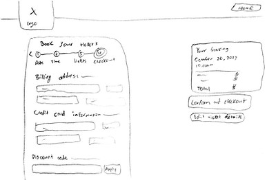
Proposed purchaser information screen
Mid fidelity wireframes
After gathering feedback on my low fidelity wireframes, I used Figma to create a set of mid-fidelity frames as a digital version. The mid-fidelity version helped to see how content is laid out on an actual screen and contains placeholder content to get an idea of layout and feel of the new ticket flow purchase. In mid-fidelity, I decided to combine the date and time screens into one, to make the experience even simpler for the user, so I've added the confirmation screen below as well.
Click through arrows below to see mid-fidelity prototype

Proposed home screen with most important details and easy readability layout.

Proposed ticket selection screen combines ticket information as well as add-ons on a drop menu, making the page feel less cluttered.

Confirmation page with booking details
Proposed home screen with most important details and easy readability layout.
High fidelity interactive prototype
Applying feedback gained from multiple iterations of prototypes and design planning, I implemented my designs into a high-fidelity prototype using Figma. I used the same design system as the current Denver Zoo experience, including font styles and colors. The design of the prototype passes WCAG AA compliance guidelines. The new high-fidelity prototype is more simple for the user, and encourages users to finish the entire process, and purchase a ticket.
My high-fidelity prototype was also user-tested for pain points and iterated on, read more about my process below.
Click through arrows below to see high-fidelity prototype
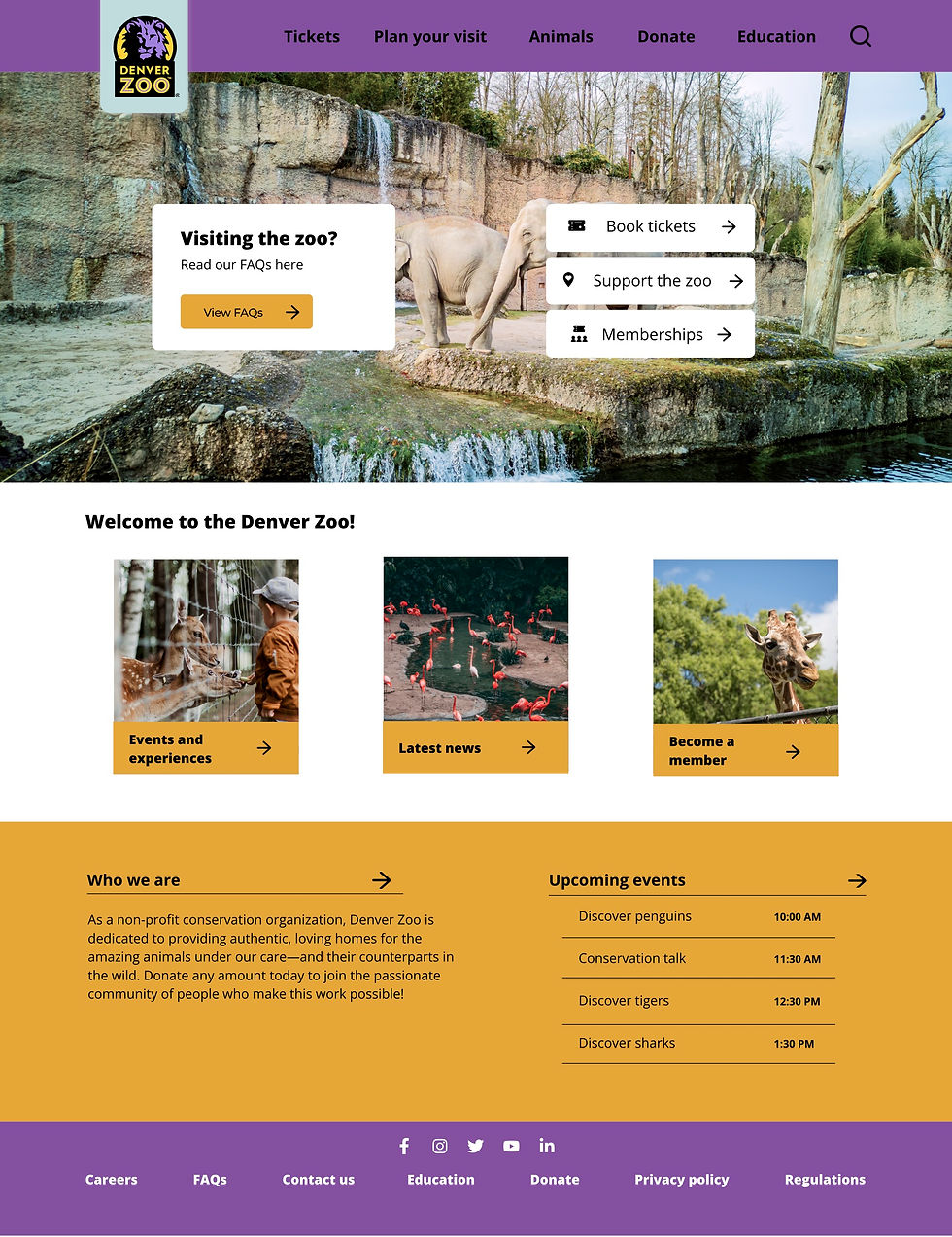
Updated home screen with Denver Zoo design system. Gives users important information and ability to purchase tickets at top of screen.

Filled in version of ticket selection screen with add-ons.

Final confirmation screen of order. Tells user details of order, and directs them on some options to re-engage with the website.
Updated home screen with Denver Zoo design system. Gives users important information and ability to purchase tickets at top of screen.
Instructor feedback
Throughout the design process, I received feedback from my instructor on my designs. Most of my feedback were minor details, but I was constantly challenged to make use of white space and space items further apart on the 12 column design grid. You can see some of this feedback of spacing implemented between my mid-fidelity and high-fidelity interactive prototype.
Evaluation and results
After creating an initial high-fidelity prototype, I conducted user testing and gathered feedback on my design to update my prototype into the state it currently is.
User testing process and pain points
User testing is a valuable tool I heavily utilized throughout this project. After my first high-fidelity prototype iteration, I conducted user testing with two users, and gathered instructor feedback.
User testing identified possible pain points of the iteration of that prototype to be:
- Move content all the way to the left and right of the grid. White space in the middle is not a bad thing.
- Confirmation screen language is confusing as to how a customer will receive tickets and next directions. Users said they didn’t know if they needed to pick up tickets, download them from the page, screenshot, or wait for an email.
- Need more information about the add-ons, or at least providing a button to go to that. As someone who has been looking at the prototype constantly and understands the Denver Zoo experience, I didn’t think about how this might confuse a user, and think this would be a great addition to add.

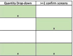
Section of user testing guide I used for high-fidelity prototype.
Updates to final prototype
To get my final prototype to the version it currently lives as above and on Figma, I added multiple features and changed designs from my initial prototype based on the user testing I described above. I implemented fixes for the pain points, including fixing spacing on the grid, adding a button for add-ons, as well as leaving white space. Another update was creating and adding the zebra stripe background. After multiple iterations, I felt that the site had gotten away from the heart of the design, the simple "zoo" feel, so I found a way in the zebra stripes to incorporate that feeling back in.
Reflection
Redesigned the "Purchase a ticket-flow" for the Denver Zoo website for a UX design class. Conducted Research, created multiple iterations of interactive prototypes, and wrote about process. Created a simple and efficient ticket flow, to encourage the user to continue through the process to buy the ticket, and not overwhelm or confuse the user.
Future plans
If I were to iterate on this design again, I would create the pop up screens, and create experiences for the buttons that link to other pages. Also, if I were to move outside of the Denver Zoo design system, I would find new fonts. The current font for the Denver Zoo feels boring, and I wish there were more combinations, again to try to incorporate more of a "zoo" feel into my designs. If I had more time on this project I would also want to make the design accessible to more users, like a mobile version for example.
Conclusion
Key takeaways from this project:
- Iteration & feedback are vital. I often found issues in my designs I had not even thought about due to outside feedback and user testing. Iterating on designs helps to produce the best result based on the feedback received.
- Use negative space! I found myself trying to fill white space with things that did not to be there. Making less use of boxes and more use of white space will prove to a cleaner-looking result in most cases.
- Design on the grid for a cleaner experience. The grid helps to produce best spacing between content in design, and vertical spacing "8px rule" will help the eyes visually divide the page.